TerraCredit
Branding, Copywriting, Website Design
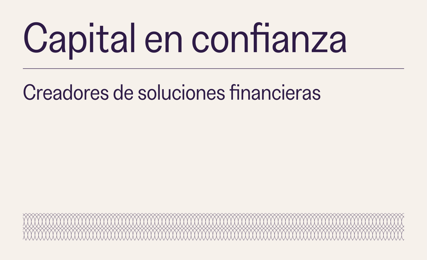
TerraCredit is a creative finance company that offers personalized, trustworthy financial support backed by real-world understanding and mutual respect.
The Brief
Most people think of debt as something negative. TerraCredit wanted to change that. Their goal was to build a brand that shows lending can be helpful, respectful, and even empowering. Unlike traditional lenders, they adapt to the needs of each person or business. Some clients pay monthly, others quarterly, some all at once. And if things don’t go as planned, they find ways to move forward, not punish. Their flexible, human approach sets them apart, but they needed a brand that could make this clear from the start.
The Solution
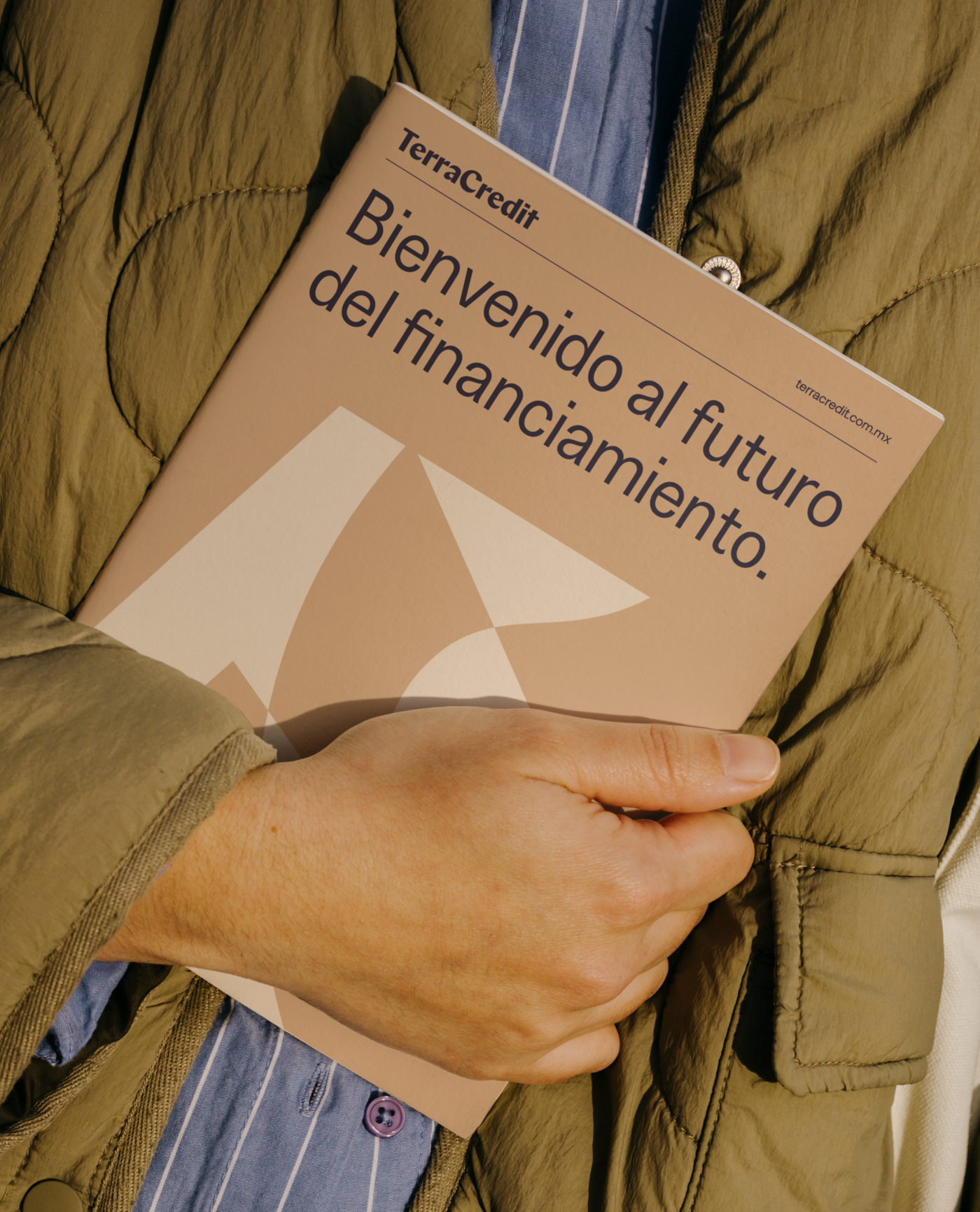
We built a visual identity that reflects TerraCredit’s honest and flexible way of doing business. The idea of "Terra," meaning land, plays a key role in how they operate. Many of their loans are backed by property, so we created a custom pattern inspired by land plots seen from above. The grid-like layout gives a sense of order and structure, while also representing the opportunity and value behind every deal.
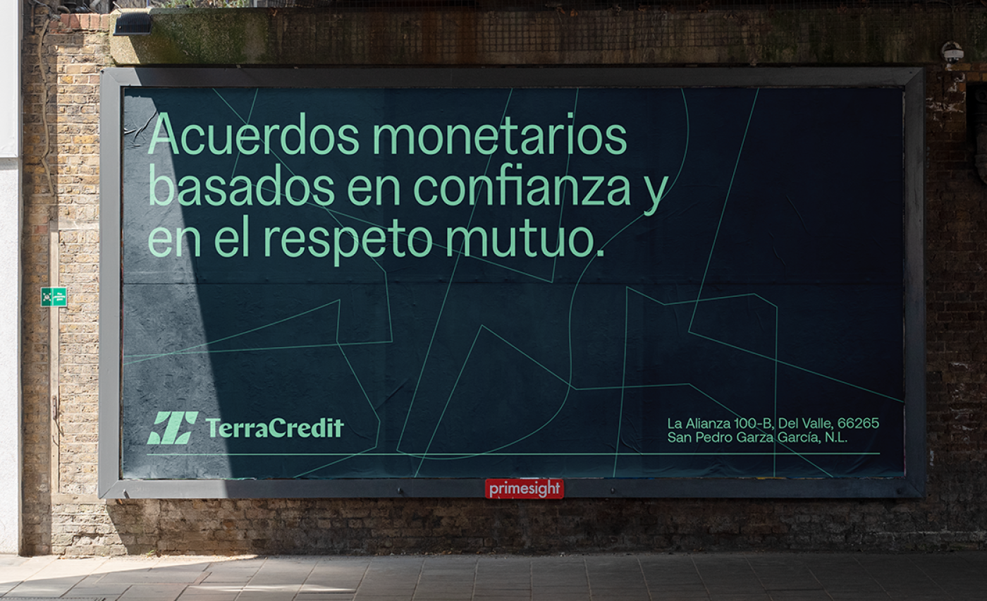
To reinforce the brand’s sense of strength and reliability, we designed a secondary pattern based on medieval chainmail. It adds texture and symbolism, evoking the idea of protection, commitment, and doing things with integrity.
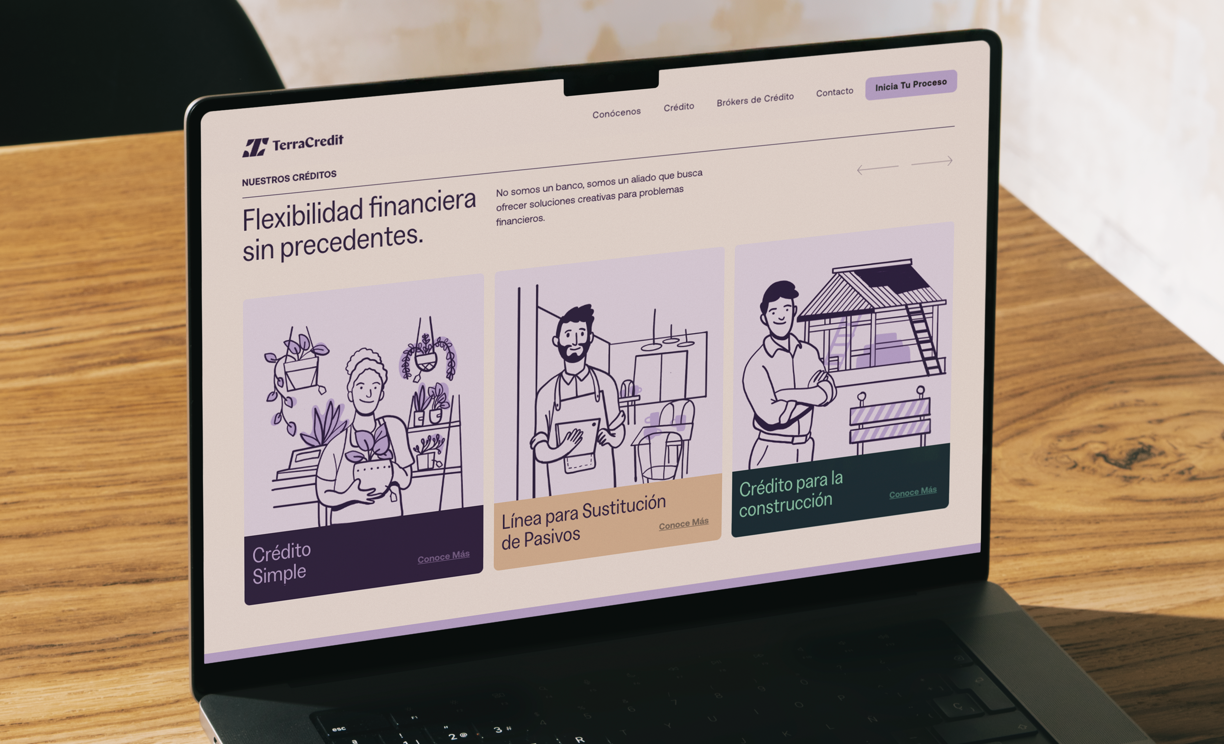
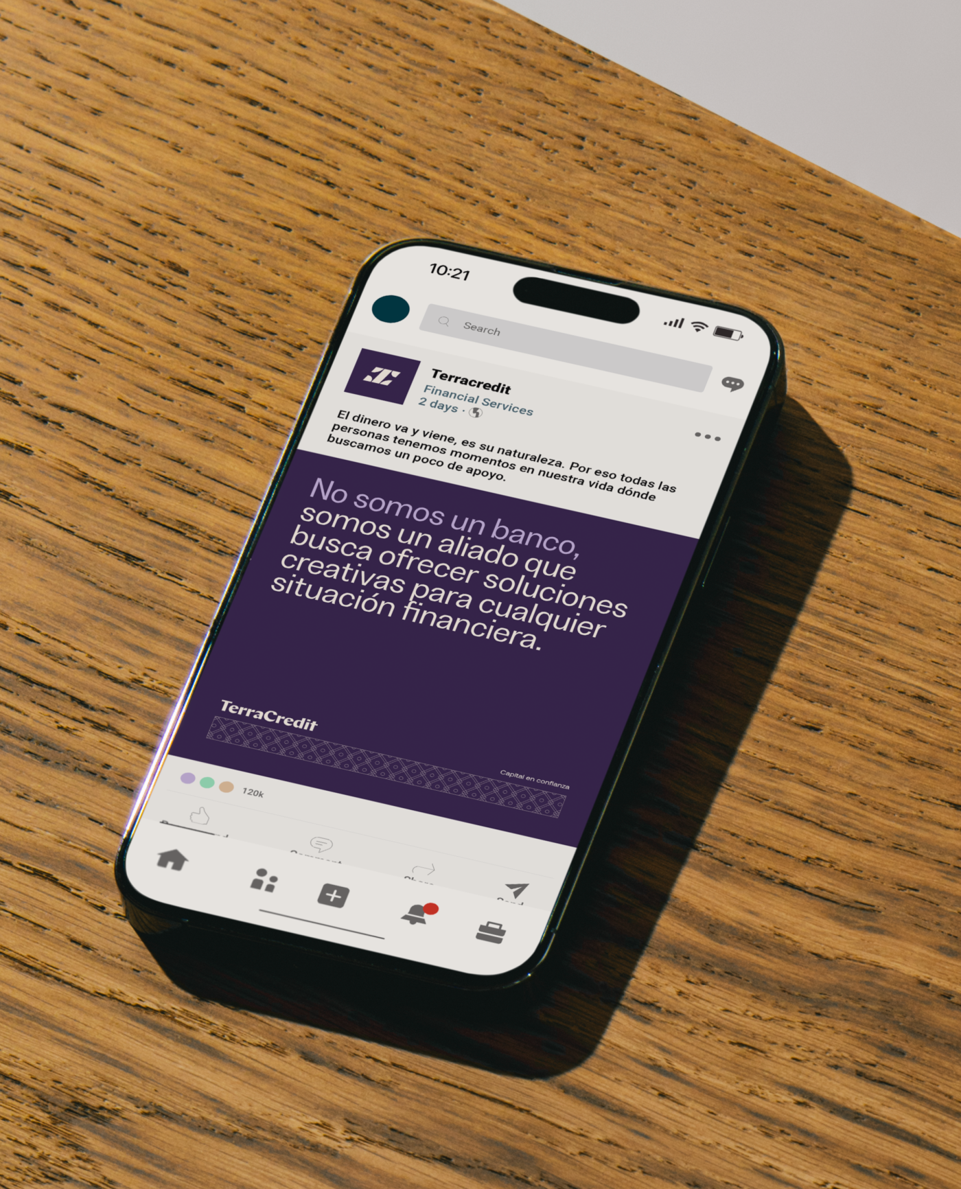
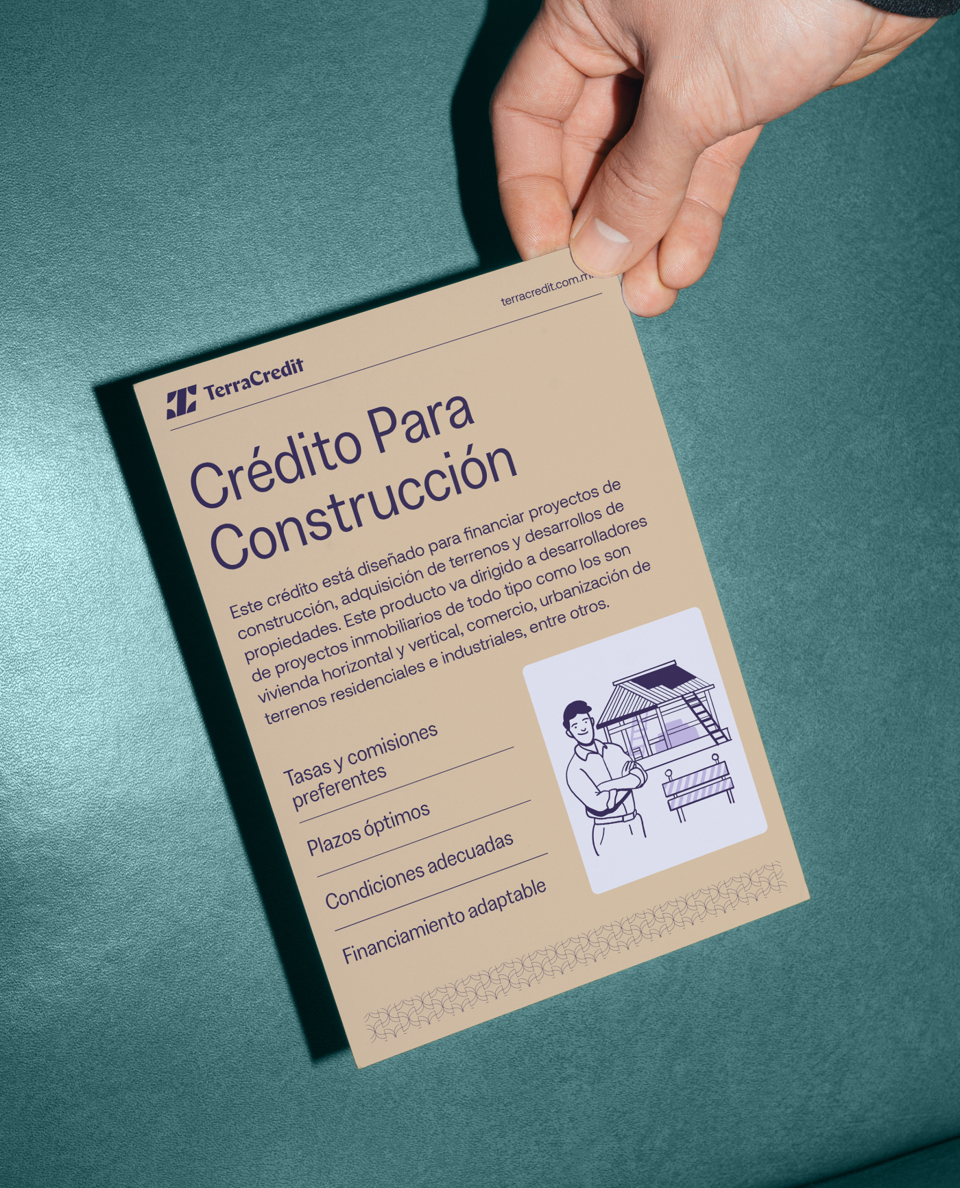
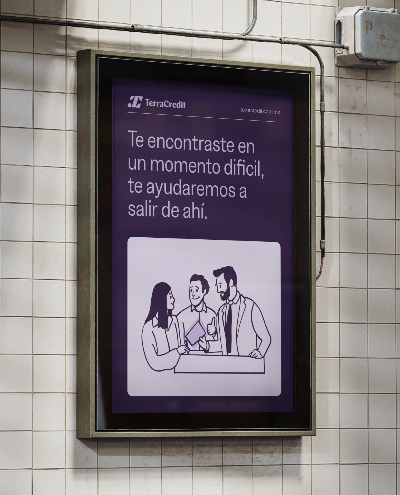
To balance out these structured elements, we brought in modern illustrations that add warmth and personality. They help tell human stories and make the brand feel more approachable, showing that behind every loan is a real person with real goals.
Together, these elements create a brand that feels grounded, trustworthy, and built to support people through challenges and into their next chapter.
To reinforce the brand’s sense of strength and reliability, we designed a secondary pattern based on medieval chainmail. It adds texture and symbolism, evoking the idea of protection, commitment, and doing things with integrity.
To balance out these structured elements, we brought in modern illustrations that add warmth and personality. They help tell human stories and make the brand feel more approachable, showing that behind every loan is a real person with real goals.
Together, these elements create a brand that feels grounded, trustworthy, and built to support people through challenges and into their next chapter.
Credits
Credits:
Creative Director: Manuel Llaguno
Lead Designer: Sara Alarcón
Lead Copywriter: Andrea De La Mora
Project Manager: Elvy Villaescusa
Illustrator: Gera Alba Tags Brand Strategy, Copywriting, Brand Identity.
Creative Director: Manuel Llaguno
Lead Designer: Sara Alarcón
Lead Copywriter: Andrea De La Mora
Project Manager: Elvy Villaescusa
Illustrator: Gera Alba Tags Brand Strategy, Copywriting, Brand Identity.

Ha sido un placer trabajar la nueva identidad de Avla junto con Firmalt.
Pierina PapiAvla
Cliente: Terra Credit
Work:
Finance